Yo yo yo!
Today's drawing lesson is going to be a part two, for my first lesson on how to draw a ferrari 355 F1.
This time we will learn how to draw the Ferrari Enzo, which is... well... AWESOME!
So lets jump right into it.
The Ferrari I will be drawing, will be facing away from us, turned a bit to the side. This calls for two points perspective. This is how I built the angle:
If you want a more in depth explanation on drawing in perspective, check out my lesson, on How to draw in perspective - One point.
Now see if you can tell where the two points are. In case you are having a hard time (one of them is easier to find then the other), I made this just for you:
Now you can see how the two points are actually very far from each other. I used 3 papers for this, one for drawing, and two more for each point.
After we set up the perspective, it is time to draw the basic lines of the Ferrari Enzo. This step is crucial, since we have to make sure it all fits in the perspective the way it should, and that all the lines are in agreement with the perspective.
Here is the basic sketch:
Notice how all lines, even the curved ones, are congruent with the perspective. Drawing curved lines in this manner is quite challenging, since there are no clear rules. You have to observe the object you are drawing, and pay close attention to the curves, from different angles.
Here is the sketch, together with the perspective lines:
Now its time for my favorite (and for me, the toughest) part. Adding the details. I add all the lights, the wheels, the details on the body of the car, and the details and way he doors are built.
Here is what I came up with:
Pay attention to how the details I added are also congruent with the perspective. This is especially noticeable in the back part of the car.
Next thing I do, is cleaning the drawing from all excessive and unnecessary lines. This lets you understand better, what you drew and how the car "behaves" in space. This is a preparation for the next step, which is coloring!
I use my favourite method of placing the paper on the window, and coloring onto a new paper. Here are some examples of the process:
So the last example is the finished, scanned and colored drawing.
Now its time to ink this beast. The thing is, this time, I'm not going to use a nib pen, but rather a Micron Pigma black pen, by Sakura. The reason I won't be using a nib pen this time, is that this Ferrari is built from many curved lines, and the Micron Pigma works great with these lines. Also, this pen draws amazingly ON/OVER colored pencils, something that the nib pen sometimes has a hard time doing.
Here are some examples of using the pen, especially on tough spots, and long curvy lines:
Like on previous lessons, since we first colored, and only then inked, the lines sort of make themselves POP with the help of the colors. For this reason, we can be extremely minimalistic with our use of the ink.
Here is an example of minimalistic use of ink, by leaving a line open and unfinished:
Here is the final version of the drawing, colored and inked:
Let me know what you think of the drawing, and if this drawing lesson helped you.
I will make another lesson real soon!
Peace,
- Liron
Read More
Hey people of the world, how have you been??
On today's drawing lesson you will learn sketching and shading techniques. I wanted to make a refreshing change from my last two lessons, which include coloring, and to show you how you can make a finalized drawing using pencil only! [=
---------------
* Update: I published a more elaborated lesson on sketching techniques I recommend you to check out at: How to sketch - Sketching techniques (Link will open in new window).
---------------
In this lesson, you will be guided with the help of a drawing I made just for that purpose. Here is a sketch of the drawing, it's a guy walking with two dogs, and taking a pic with his phone.
So basically I made a rough sketch of the scene.
On holding the pencil:
When I drew this, and on the following phases, I alternate mostly between two ways of holding the pencil:
1. Holding on the very back of the pencil - this helps me in drawing long, curved lines. The reason for this is that holding the pencil that way uses the natural pivot of the palm, and helps in getting the curves quickly and accurately. It does take some practice though. Here is an example to make it simple to understand:
2. The second way is holding the pencil very close to the lead - this gives more control and accuracy, and helps in places with many small lines, such as the fur of the dogs (and especially that tail of the Husky...).
A word on the speed of drawing:
Bottom line - sometimes you have to draw fast! I don't mean you have to rush through the drawing. I do mean that you have to throw the lines quickly. This is true especially for those long curved lines I was talking about. This can be quite challenging sometimes, but you get used to it. In this example specifically, it is less needed, but when inking it is sometimes extremely important to use quick lines, since otherwise the pen shakes and won't give you the wanted result.
Lets now move on with the drawing - here I darken the lines.
Since my drawing is going to be pencil only, my pencil is my "ink and pen". For that reason, I go over the lines again to make them "pop" the way I want, and to give it a more finalized look. I try to make it as non sketchy as I can. Pay attention to the folds here, I will probably make a different post on this subject, but there are many great resources online.
This is what I got:
----
Check out my new website and subscribe for a FREE eBook! (=
LironYan.com
----
Darkening and Shading
After we've got our finished and refined sketch, it is time to darken what's necessary, and to give it some shading.
What should you darken?
As a general rule, you can darken whatever you want! [=
Some colors however ARE darker when turning images into black and white. A good example for this is the color brown. The best thing to do is to make your own research. here is a short check I made using photoshop:
As you can see, the brown-ish colors are pretty dark, while the blue and yellow-ish aren't.
In my drawing, I chose to blacken the dude's hair, and to only darken the pants (they were actually black, but for the sake of teaching you shading, I will simply make them dark).
Pay attention to how I darken the fur of the dogs. I use short lines that mimic the furs shape, and that creates a more dynamic and realistic result.
Another important thing that helps in making the final drawing cooler, is the direction of the lines which are used to darken areas. I darken in the natural direction of the body being darkened. Like this example of me darkening hair, look how the lines go with the "flow" of the hair. This gives the drawing a nice 3dness:
I learned this from Mark Crilley who is an amazing artist, whose videos you have to check out.
Shading
This is a huge topic, I will try to make it as clear and simple as possible.
There are a couple of main things that influence how shadows are going to look:
A. The power and distance of the light source.
B. The direction of the light source.
C. The distance of the body from its shadow (more correctly, the distance of the body from the surface on which it's shadow is going to appear)
To make it simple - here are some examples I made:
As you can see, the parameters at the top influence the darkness of the shadow, its size, its fuzziness and obviously its location.
In my drawing, the shadow is coming from the top, since its outside, at daytime, and the sun is the most prominent light source. It's late afternoon so the shadows on the floor are week (and also, my scanner + pencil causes them to become even weaker).
Also, I want to emphasize the shadows on the pants, where the knees and shoes are:
Here is the final drawing, after taking into account all of what we talked about!
I hope this drawing lesson was more "zoomed in", and gave you some practical knowledge you can use in order to improve your sketching and shading techniques. I plan to make a more step by step lesson real soon, that will be less theoretical (=
So keep your eyes open for updates!
Also, check out my new website and subscribe for a FREE eBook! (=
LironYan.com
Until next time,
- Liron
Read More
Hey world!
So today I'm going to do something which I haven't planned on doing. I'm going to make another "How to draw a City Landscape" drawing lesson, this time from Tel-Aviv (one of Israel's coolest cities).
Basically, I was in Tel-Aviv with a good friend of mine, and we went to Dizengoff Square and started taking pictures. Then I thought to myself, wouldn't it be cool to share this great view with everyone?
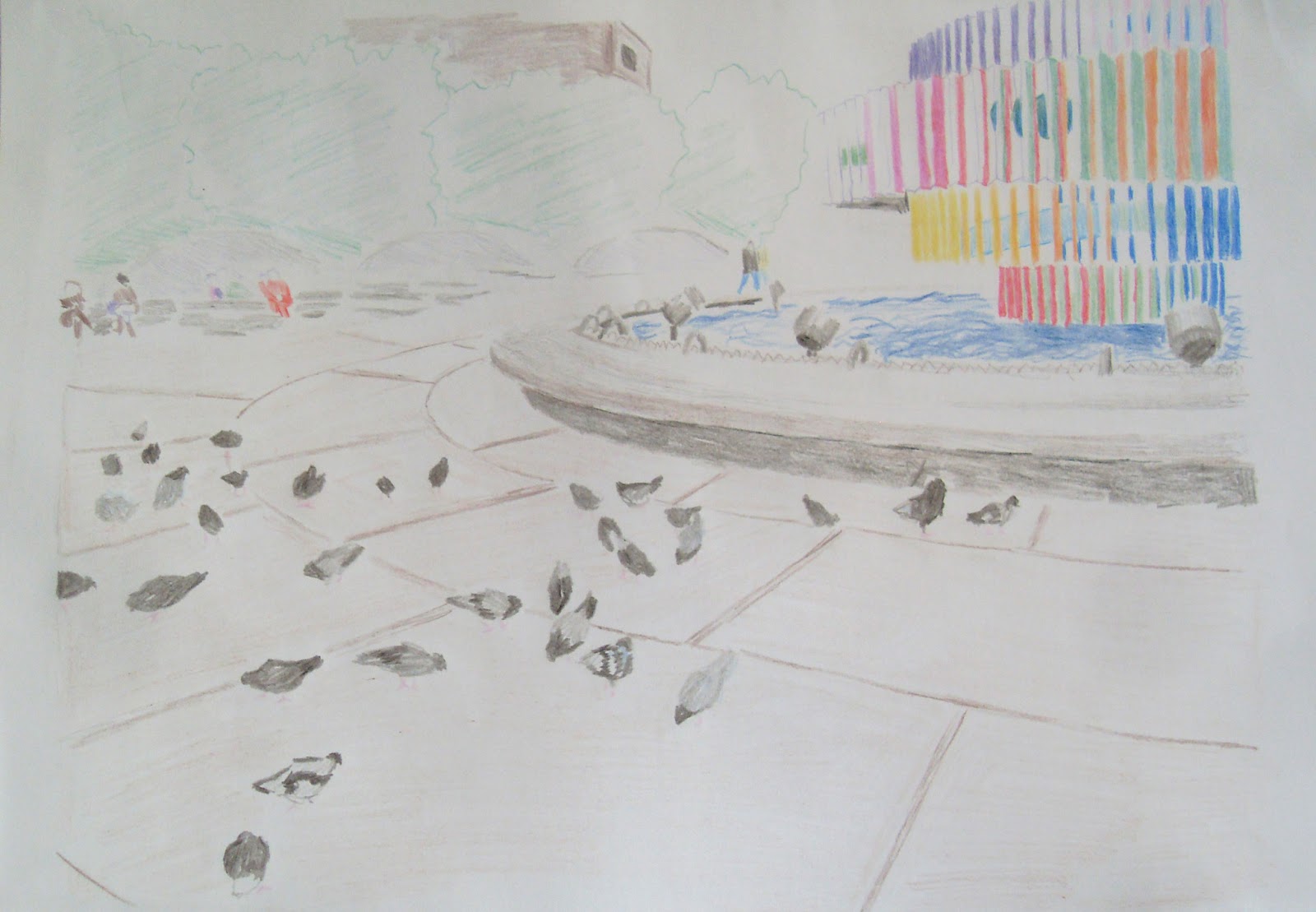
Today we are going to draw this:
So lets get started!
First things first - I made a very light, non detailed sketch of where basically everything is going to be. And yes, these are the pigeons.
Now I go over the sketch and darken things up. Here is a small tip: while you are drawing, darkening or inking, put a small piece of paper under your drawing hand, like I did. That way you won't smear your work and possibly ruin it.
After going over all the lines and making them clearer, here is a scanned version of the drawing. The lines are very light, since my scanner sometimes doesn't do well with pencil [=
Now I'm going to do what I did in the previous lesson, and tape the drawing, along with a new clean paper on top of it, to the window (like a light table). Now I can do the coloring on a new paper, and easily get rid of the pencil work.
After I finish coloring, this is what I got:
Now its time to start inking. Here I go at it, inking AS SPARINGLY as I can. Like I taught you in the previews lesson, because I used colors first, I can now sort of "sit back" with the ink, and let the colors do most of the work.
A word on mistakes:
On that last image you can see I've made a couple of mistakes with the inking. It's important for me to make it clear - this is TOTALLY OK. When drawing, you have to accept the fact that some mistakes are inevitable. Some of the mistakes can be corrected, while others can be completely prevented if you work correctly (for example - putting that piece of paper under your hand).
In this example, I accidentally had too much ink "bleed" out of my nib pen. I try to smooth it out as much as possible, and I can probably leave it at that. Sometimes, more "drastic" measure may need to be taken, such as using Tipp-Ex. This time its unnecessary. And keep in mind that no mistake means the end of the world [=
So there you have it - the finished drawing:
I hope you enjoyed this drawing lesson. This is it for "How to draw a City Landscape", for the time being....
On another note, I plan to make the next drawing lesson really really educational, and to try
and take you step by step, through the drawing process, while talking about some techniques. It is going to
be on a highly demanded subject, so get ready!
Here is a sneak peak.... (;
Peace,
- Liron
Read More
Hello people of the world!
Today I have a special treat. In this drawing lesson, you will learn how I drew... this:
This scenery is from Prague's Old Town Square (Staromestske namesti). I was traveling there a couple of months ago, and it always amazes me how inspiration comes in big waves when I see new views and cities.
I think this is a really special post, because let me tell you this, I believe this is one of the most professionally finished drawings I've ever made, and I did many things differently then most of my other colored drawings.
So lets start by looking at the first sketch of this (I know you can barely see, don't worry, next ones are darker).
This entire drawing is based on a picture I took when I was there. This is really a simple sketch, to set up the perspective, the location of the important figures and buildings, and all the rest of the basic stuff.
Here I started giving the lines more strength, and adding more details:
In this specific drawing, I don't go in order from left to right, or anything like that. I decided I'll go by order of importance. So I first go over the woman and child, then the band and the equipment, then the crowd and people behind, and then the buildings.
Here is the scanned version of the finished sketch:
In here you can see I finished most of the details, and notice how I was really "light" on the buildings and background. This is really important when drawing scenery like this one, because if I went into too many details it would completely shift the focus from the band and crowd, and we don't want that to happen now don't we? [=
The next step is where I want to stop and explain what I did in more detail.
When making a drawing with the purpose of coloring it, there are many ways to go about doing it. What I almost always do, is simply finish the pencil version, go over it with ink (usually a nib pen) and then finally coloring it.
This time however, I decided to... First color it, and THEN ink it.
That method has a few HUGE advantages, since it allows you to give depth using the colors first, and only then go over it with ink, only on the places necessary. That way, instead of "coloring closed areas" on the drawing, you color it to make it POP, and then ink as little as possible to keep it dynamic.
And this is how I did it:
If you have a light table you can use one. I don't, so as you can see, I taped the sketch and another blank paper to my window. That way I can see through, and color the drawing on a fresh paper, without all of the pencil lines I've done in the sketch! Some people just color the same page, but I wanted it to be as clean as possible.
here is a close up of the coloring process.
Eventually, this is what I got, nice eh? No lines, only colors.
Now It's time to ink it up! Here is the beginning of this step:
As you can see on the left, I'm using my trustworthy nib pen. And as I said before, I ink ONLY whats necessary.
Here's some more:
I can see so many lines that I would have inked for sure, and would be so useless since I can indicate them, like here, using colors.
And now... here is the final result again!
Again, in my opinion this is one of the best finished drawings I've ever made, and I had tons of fun making it (=
Hope you enjoyed this drawing lesson as much as I did, and also learned a thing or two.
Until next time,
- Liron
Read More